Page Builder
Overview
The Page Builder provides tools for document layout and it focuses on creating documents in sections and components. A section is essentially a row of one or more components, and each component is a certain type determined by its content. Different document component types are available, and each section can be positioned and named within the Page Builder (the section names allow entire sections to be included by other documents). Any fine-tuning HTML editing can be done later with the Source Editor.
To access the Page Builder, open any existing document or create a new document or navigate to Main Menu > Development Tools > Page Builder.
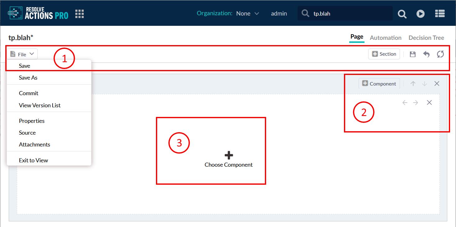
- The Screen toolbar has the "File" drop-down menu with its options, "Add Section" button, "Save" button,"Exit to View" button and "Reload" button.
- Add Section button - Appends one new section at the bottom of the page. It is a plain container which is later filled in with components.
- Save button - Saves the all changes applied not only to the page layout but to the Automation model and Decision Tree model. "Save" is a global operation that applies to the whole Automation. Using the "Save" button equals to using the "Save" drop-down option in "File" menu as well as using the shortcut key Ctrl+S. In order for the button to become available there must be a change applied to Page, Automation or Decision Tree else it is inactive. Each time a change is saved to a wiki a new draft version is created. For further details about using draft versions for continuous development refer to Version Control Documentation.
- Exit to View button - Returns you to read-only mode of the Page Builder editor. If there are unsaved changes, you will be prompted to save or discard them before proceeding.
- Reload button - Reloads the Page layout to the latest saved version. If there are unsaved changes you will be warned that they will be lost if not saved.
- The Section Navigation toolbar allows you to add section rows and re-position their order. You can also delete entire rows of sections.
- The Chose Component toolbar allows you to add new components within each row, by clicking the "plus" icon and re-order them within the row by dragging and moving the tabs. Each individual component appears as a tab, with the component type displayed as the tab label (you can delete a specific tab by clicking on the small "x" button in a tab). The source code for the selected tab will display in the work area below each section row. The document components will be displayed on-screen proportionally by default: two components will split the screen in two equal halves, while three components will each take one-third of the screen width. The proportions can be changed via the Section Properties button left of the component tabs in each section row.
The Title field allows you to name the currently-selected section. Section names allow entire sections to be referenced externally by other documents with the #includeForm function.
Page Builder Components
The Page Builder creates documents comprised of different document sections and components. Each section can contain multiple components of different types. These sections and components are arranged by the Page Builder in rows and columns on the screen.
Both the Add Section button at the top Screen toolbar and the Section Tabs plus icon will bring up the Choose Component dialog box that lists the different section types available. There are components for things like code (code samples, Groovy, HTML, or JavaScript code), Automation components (ActionTask, Model, Progress, Result), and pre-built components (form, image, infobar, table).
Procedure:
- Select Edit.
- Select the Plus icon.
Text Based Components and Links
- Code Sample - automatically adds the {code} tags to display code literally, allowing any text to be shown onscreen as-written and unrendered. There is an option to also display line numbers for easier viewing of the code.
- Page
- Resolve Markup
- Text Editor
Automation and Status Components
There are seven document component types that the Page Builder uses for running Resolve Actions Pro automation or displaying automation results:
- ActionTask - Allows the direct execution from the wiki page of a single ActionTask. The component code will link to a Custom Form that executes a specified ActionTask, with an option to pop-out the relevant window.
- Automation - Allows the direct execution of a Runbook automation (or automation built in the Automation Builder) from the wiki document page. The automation can execute multiple ActionTasks. The component code links to a Custom Form that contains automation-specific parameters and executes a specified automation, with an option to pop-out the relevant window. Additionally, a Result document component is automatically added to the document page to display execution results, and all corresponding Detail or Result components will refresh and update to display executed results.
- Detail - Displays the detailed results from the Active Worksheet for the specified ActionTask. The component is functionally similar to inserting detail markups for the specified ActionTasks, and will automatically refresh with every execution of the ActionTask.
- Model - Displays the automation or decision tree model from the specified wiki document using model wiki markups. The model nodes will turn red and green as the execution progresses through the model. The "Height" and "Width" parameters determine the on-screen frame that displays the model.
- Progress - Adds {progress} tags that track the progress of executed automation. The component options allow the use of customized images and text for "in progress" and "completed" conditions.
- Result - Automatically adds the result tags to display Active Worksheet results within the specified parameters. It will automatically refresh after the execution of any ActionTask or Runbook.
Data and Form Components
The Page Builder provides seven document component types with pre-built codes for miscellaneous functions:
- CSV Import - Allows you to create a custom DB table using data defined in a CSV file. Provide the same functionality as the Create Table main menu item.
- Diff - Allows you to compare table records stored in the Actions Pro database. It is suitable for configuration change management. See Diff Component for configuration and usage instructions.
- Form - Displays a pre-built custom form page for viewers to fill (for example, input contact information).
- Image - Inserts the {image} mark up tag with specified parameters. The "Source" field brings up the Global Attachments list, but files stored locally can also be uploaded.
- Infobar - Inserts the Actions Pro Infobar summary, which has interactive tabs for viewers to rate or flag the document page, provide feedback, and see the recent revisions to the page.
- Secure - Allows users with the appropriate password to read an encrypted value. The revealed value is set in an ActionTask property.
- Table - Adds the {table} markups and allows the input of a basic table and values. The first row constitutes the column headers and must be labeled when first created. The cells of subsequent rows can be filled in with data at any time (double-click the desired cell). However, adding or removing columns will recreate the entire table and any values inputted into those cells will be lost.
- XTable - Allows greater formatting and control than a simple Table component, including referencing SQL databases. Every "Add/Remove" button accesses additional formatting options for that specific column or row. For a successful SQL query, make sure that the column names match the SQL query fields. The "Drilldown" field inserts a "More Information" icon into each individual table entry. A common "Drilldown" field value is: /resolve/service/wiki/view/^Namespace/^NameThis references the two SQL variables "Namespace" and "Name" to access the corresponding wiki document page for that table entry.
Source Code Components
There are three document component types that the Page Builder uses for entering page content and for displaying or rendering source code:
- Groovy Script - Specifically contains Groovy script to render, and automatically adds the pause rendering {pre} tags and <% ... %> markups denoting execution of Groovy code. Groovy is a server-side scripting language, typically used for database queries.
- HTML - Component for HTML code, similar to default Source component because Actions Pro automatically renders HTML code.
- JavaScript - Automatically adds the pause rendering {pre} and {script} tags specifying "text/javascript" for client-side (browser-based) scripting.
The Source Editor
The preferred Page build method is the WYSIWYG editor where you add page components using visual tools. Using the source editor directly is not recommended.
The most flexible method of document creation is to use the Source Editor to directly code documents using a combination of wiki markups, standard HTML, and CSS. However, extensive knowledge of HTML is necessary to create complex or detailed pages. In many cases, the Source Editor is useful to edit existing pages (whether created in the Source Editor or Page Builder) to "clean up" any document page display errors. (Development Guide; Document Development).
To access the Source Editor:
- Open any existing document or create a new document.
- Navigate to File drop-down menu and select Source option.
The Source Editor shows the source code for the document page. The mixture of wiki markups and HTML code will render in a certain order: first Groovy script code is rendered, then Velocity script, and finally wiki markups are converted by the Wiki Rendering engine into HTML. The resulting HTML is rendered by the user's browser, which can be seen with the View tabbed display.
To improve the document in terms of maintainability, consistency, usability, and visual impact, consider visual elements and styles (CSS) in the layout and scripting. Use Javascript for browser-side scripting; use Velocity or Groovy for server-side scripting. Documents can be created quickly and easily using wiki markups and supplemented with simple HTML.
Wiki Markup
The Wiki syntax markup, also known as Resolve markup, provides an alternative to HTML and simplifies document creation and maintenance. The markup is converted by Actions Pro to HTML before serving the page.
With Wiki syntax markup, you can format text (such as headers and lists), create links, add attachments among others.
Even when not using the code editor, the Wiki syntax markup is auto-generated in the background as you add components. For example, the {section} tags delineate all document sections. Other tags are specific to Automations: display automation results, implement user interaction, control Page rendering regarding scripts and other non-wiki markup languages, or control other aspects of the UI.
Be consistent with your formatting when writing wiki syntax markup:
- Be careful with the use of white spaces:
- New lines are rendered with double return or \n (single return is ignored).
- White spaces before or after special character codes could change rendering.
For example, no space after an asterisk (followed immediately by text) will render the text as bold-type, while a space after an asterisk will bullet-point the text.
- To display special characters literally, prefix them with the backward slash "\". The pause rendering
{pre}and display code{code}tags are especially useful when controlling the rendering of mixed document source code containing both Wiki markup and scripts.
{action}
Used for inserting an ActionTask into the document. Page visitors can click on the embedded link to execute the ActionTask. A popup will prompt the visitor for any required ActionTask parameters.
Examples:
- An embedded ActionTask:
{action}taskname#namespace{action} - An embedded ActionTask with a provided link text:
{action}link text>taskname#namespace{action} - An ActionTask with predefined parameters:
{action}taskname?PARAM1=value1&...{action}
{attach}
Displays a link allowing the Page visitor to download a file from the Page's attachments.
To manage attachments, go to File > Attachments.
When referencing the file, use its full file name, including extension.
Example:
{attach:email.csv}
*bold*
Used to format the enclose text as bold.
Example:
Here is some text with a *bold* word.
{code}
Used to display a code block without wiki markup formatting.
Example:
{code}
No <strong>bold rendering</strong> in HTML.
No *bold rendering in* wiki syntax.
{code}
{detail}
Displays the detailed results of a specific ActionTask from the worksheet. The result is refreshed constantly until the Automation execution is completed.
There might be more than one matching result detail. Only the latest matching result detail is displayed by default, but you can configure the maximum number and offset of the entries to be display (ordered by time descending).
These are the parameters that you can set to the detail tag:
| Name | Default | Value |
|---|---|---|
| refreshInterval | 5 | Number of seconds before the next refresh of the results. |
| max | 1 | Maximum number of result detail entries to retrieve. |
| offset | 0 | Starting offset for retrieving the results. |
| separator | Separator used between result entries. |
Example:
{detail:refreshInterval=5 | separator=separatorCharacter | max=maximum | offset=offset}
taskname#namespace
{detail}
{encrypt}
Renders a link on the page that requires the user to enter a secret key before they are allowed to view the value.
To configure, set up a pair of ActionTask Properties under Main Menu > Content Management > Properties: one for the key and another for the value. You can encrypt the properties to protect sensitive information. You then put the {encrypt} tag in your Page and use its key and value properties to reference the ActionTask Property names.
Example:
In the following example, entering myKey into the pop-up will display My Encrypted Text. It assumes that you have created these ActionTask Properties in the test namespace:
keyset tomyKeyvalueset toMy Encrypted Text
{encrypt:key=test.key|value=test.value}
{encrypt}
Heading
Applies headings to the document. Always use the digit 1 when creating the headings.
1 Heading Level One

1.1 Heading Level Two

1.1.1 Heading Level Three
{image}
Displays the image from the Page's attachments.
To manage attachments, go to File > Attachments.
When referencing the image file, use its full file name, including extension.
Examples:
The following example displays an image with a fixed width and automatically scaled height:
{image:chat2.jpg|width=50}
The following example displays an image with fixed width and height:
{image:chat2.jpg|width=50|height=100}
The following example displays an image with a border:
{image:chat2.jpg|border=1}
includeForm
Renders the content of another Page.
Example:
#includeForm("Doc.TestInclude")
{infobar}
Renders a tab panel on a document which allows users to view and download the Page's attachment, view the Page's history, and more without having to access Actions Pro as an administrator or a developer.
Use the following syntax to embed the Infobar:
| Name | Default | Value |
|---|---|---|
| height | 300 | Height of the Infobar |
| attachments | true | If true, Page visitors will be able to see its attachments and download them. |
| history | true | If true, Page visitors will be able to see its history (i.e., changes, activity, etc.). |
| tags | true | If true, Page visitors will be able to see the tags associated with it. |
Example:
{infobar:attachments=true|history=true|tags=true}
{infobar}
~~Italic~~
Used to format the enclosed text as italic.
Example:
~~Here is some text in italic~~
Bulleted or Numbered List
Formats lines as a bulleted or a numbered list.
Example:
* List Item Level1
** List Item Level2
*** List Item Level3

1. Numbered List
11. Numbered List
111. Numbered List

1(5). List Starting with 5
11(8). List Starting with 8
{model}
Displays an Automation model while it is being executed. Its nodes will turn red and green as the execution progresses through the model. Options are as follows:
| Name | Default | Value |
|---|---|---|
| refresh | true | Refreshes the automation graph results |
| refreshInterval | 5 | Number of seconds between refreshes |
| width | 100% | Frame width |
| height | 400 | Frame height |
| status | condition | Use condition or severity to determine the node color |
| zoom | 1.0 | Resize the image based on zoom factor (0.2 - 5.0) |
Node colors based on condition:
- GOOD: Pale Green
- BAD: Red
- UNKNOWN: Light Cyan
Node colors based on severity:
- CRITICAL: Red
- GOOD: Pale Green
- WARNING: Khaki
- SEVERE: Orange
- UNKNOWN: Light Cyan
Example:
The following example displays the specified automation model with default settings, using the current wiki as the automation model:
{model}
{model}
The following example displays the automation model from the specified Page (fullname) with defined width and height:
{model:refresh=true|refreshInterval=5|width=100%|height=400|wiki=namespace.docname}
{model}
The following example displays the automation model setting the node colors based on the condition value:
{model:refresh=true|refreshInterval=5|status=condition}
{model}
The following example displays the automation model setting the node colors based on the severity value:
{model:refresh=true|refreshInterval=5|status=severity}
{model}
<novelocity>
Ensure that the enclosed text is not rendered by the velocity engine. An example could be an exception stack trace that uses the dollar sign in the text to indicate locations in the stack trace where errors occurred.
Example:
<novelocity> your text to exclude velocity rendering </novelocity>
Paragraph Treatment
All adjacent text lines are treated as the same paragraph. To insert a line break, include \n or \ at the end of the line. A blank line will also insert a paragraph break.
Example:
Here is a line of text.\n
This text continues on the next line.

Here is a line of text.
This text continues on the same line.

This is the first line.

This second line is a new paragraph.
{pre}
Prevents the rendering of the code enclosed between the tags as wiki but still allows HTML rendering. Use it when you want to display any wiki markup literally onto the Page.
{pre} ... {pre}
{quote}
Formats the text as a quote and can provide a source link.
Example:
{quote:http://www.example.com}
Here is some text with a quote
{quote}
{result}
Displays a ActionTask's result from the worksheet with the document. The list of ActionTasks is specified between the {result} tags. If no ActionTask is listed, all the ActionTasks within the worksheet is displayed.
This tag supports the following options:
| Name | Default | Value |
|---|---|---|
| text | Show/Hide Results | Summarization text for the section |
| refreshInterval | 5 | Number of seconds between periodic result updates from the worksheet until the Automation process has completed. |
| encodeSummary | false | Allows the summary to contain HTML text for rendering. Possible values: true or false |
| order | asc | Order result by execution time |
The following example displays the results for the specified ActionTask:
{result: text=summary text | encodeSummary=true | refreshInterval=5 | order=asc}
task1#namespace
task2#namespace
{result}
Special Characters
Use the backslash (\) to escape special characters. Use double hash sign (##) to insert comments.
\< For < (also can use &lt;)
\> For > (also can use &gt;)
\\ For \
\n For newline
## This is a comment
--Strike-through--
Formats the enclosed text as strike-through.
Example:
--Here is some striked text--
{table}
Defines a table.
The following example defines a table with two columns: Category and Sales:
{table}
Category | Sales
Category 1 | 100
Category 2 | 50
Category 3 | 50
{table}
[PageLink]
Cross-links between Pages.
The following example links to another Page within the current namespace:
[WebHome]
The following example links to a Page within a specific namespace called Runbook:
[Runbook.WebHome]
The following example links to a Page providing the link text:
[link text>Runbook.WebHome]
Document Attachments
Actions Pro allows documents to include attachments in the form of images that appear on the wiki page or general attachments, usually files that appear as download links. Attachments can be exported and imported along with the document and are "location independent", meaning they do not need to be maintained as content on each UI server. However, as attachments are stored on the Actions Pro system, it is best to minimize as much as possible the attachment sizes.
There are two types of attachments: local and global. Local attachments are linked only to the specific document, while global attachments can be shared and referenced by any document. Local attachments can be exported with the page for migration to another environment; global attachments are also exported with the page but are no longer global in import. To upload a local attachment and link to a document, switch to the Attachment screen in the Edit tab display for a document. Click "Upload" to browse for your file or files, or drag them from a separate file browser window and drop into the Attachment list space. To download a local attachment, click the corresponding green, downward arrow on the far right of the Attachment list.
You can also "Delete" or "Rename" attached files with the appropriate buttons (select multiple files using CTRL or SHIFT). From the Attachment screen, you can also link the document to global attachments with the "Reference Global" button. Clicking "Reference Global" brings up a dialog box listing the available global attachments to link. A global attachment file appears on the attachment list with a (Global) label appended.
Upload/Download Global Attachments
To upload a global attachment and make it available to add to a document:
- Locate Global Attachments item in the Wiki Administration menu.
This will bring up an Attachments list from which a user can upload, rename, or delete global attachments. - Click the name of the desired file in the Attachments list.
Recommendations
File attachments added to a document can be used as either an image (if an appropriate image file) that displays on the wiki page or as a link in the page for the viewer to download the file.
The {image} and {attach} wiki markups are used, respectively, for either purpose. The {image} tag will display the image file in its exact page location, and must be used every time wherever the image is desired. The {attach} mark up causes a link to the attachment to be displayed. Clicking the link launches the appropriate program to download the attachment.
If an image file is referenced with an {attach} mark up, then the resulting link will download the image rather than display it. Attached images can alternatively be referred to by an URL if the wiki mark up cannot be applied (such as in HTML code where URLs must be supplied). However, URL links will not adjust or update if the location of the original images are changed.